
.avif)


Mobile-Friendly Website Design Toronto
Get high-performing mobile-friendly website design in Toronto with AETH Digital. Boost speed, SEO rankings, and conversions with responsive, user-focused design...
Mobile-Optimized Web Design in Toronto: Driving Growth in a Mobile-First Era
In the modern digital ecosystem, mobile devices have become the primary medium through which users interact with businesses online. As consumer behavior continues to evolve, companies must ensure their websites deliver exceptional mobile experiences. In a competitive city like Toronto, where users expect speed and efficiency, a mobile-optimized website is critical for staying relevant and profitable.
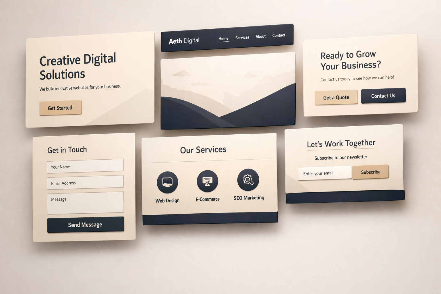
At AETH Digital, we specialize in crafting advanced mobile-responsive websites that combine design excellence with performance-driven strategies. From user experience to technical optimization, every element is carefully designed to maximize engagement and conversions.
The Shift Toward Mobile-First User Behavior
Over the past decade, mobile usage has grown exponentially. Consequently, users now rely on their smartphones for browsing, shopping, and decision-making. This shift has fundamentally changed how websites must be designed.
Additionally, search engines have adapted by implementing mobile-first indexing. This means your website’s mobile version directly impacts your visibility in search results. Therefore, businesses without proper mobile optimization risk losing both traffic and revenue.
What Defines a Truly Mobile-Optimized Website?
A mobile-optimized website goes beyond simply resizing content. Instead, it delivers a seamless, intuitive, and high-performance experience tailored specifically for mobile users.
Core characteristics include:
- Fluid layouts that adapt to any screen size
- Lightning-fast loading speeds
- Touch-friendly navigation and interactive elements
- Structured, easy-to-read content
- Clear and compelling calls-to-action
Moreover, at AETH Digital, we enhance these fundamentals with advanced performance optimization and conversion-focused design strategies.
Why Mobile Optimization is a Business Imperative
A mobile-friendly website is not just about aesthetics it directly impacts your bottom line. In fact, businesses that prioritize mobile optimization often experience higher engagement and stronger customer retention.
Improved Customer Engagement
When users can easily navigate and interact with your website, they are more likely to stay longer. As a result, engagement rates increase significantly.
Stronger Search Engine Presence
Since mobile usability is a ranking factor, optimized websites perform better in search results. Consequently, your business gains greater visibility.
Increased Conversion Opportunities
A seamless mobile experience reduces friction in the user journey. Therefore, users are more likely to complete actions such as purchases or inquiries.
Lower Abandonment Rates
Slow or unresponsive websites frustrate users. On the contrary, fast and optimized sites encourage users to explore further.
Core Elements of High-Performance Mobile Web Design
Designing a mobile-optimized website requires a strategic approach that balances aesthetics, functionality, and speed. To achieve optimal results, several critical elements must be implemented.
Adaptive and Responsive Layouts
Responsive design ensures your website adjusts dynamically to various screen sizes. In doing so, it provides a consistent experience across devices.
Speed and Performance Optimization
Mobile users expect instant results. Therefore, optimizing images, reducing code, and leveraging modern frameworks is essential for maintaining fast load times.
Simplified Navigation Structure
Clear and intuitive navigation is crucial. For this reason, menus should be easy to access, and buttons should be large enough for touch interactions.
Content Designed for Mobile Consumption
Content should be concise, scannable, and visually structured. For example, using headings, bullet points, and short paragraphs improves readability.
Conversion-Focused Design
Every element of your website should guide users toward a specific action. Whether it’s making a purchase or contacting your business, clear CTAs are essential.
AETH Digital: Transforming Toronto Businesses with Mobile Excellence
Choosing the right digital partner can make a significant difference in your online success. In this context, AETH Digital offers a comprehensive approach to mobile-friendly web design.
Customized Digital Solutions
We create tailored websites that reflect your brand identity and business goals. Unlike generic designs, our solutions are unique and scalable.
Performance and Speed Optimization
Our development process prioritizes speed and efficiency. As a result, your website delivers a smooth and responsive experience.
Integrated SEO Strategy
We incorporate SEO best practices from the ground up. Consequently, your website is optimized for both users and search engines.
Continuous Improvement and Support
Our commitment doesn’t end at launch. Instead, we provide ongoing optimization and support to ensure long-term success.
The Power of a Mobile-First Design Approach
Mobile-first design is a forward-thinking strategy that prioritizes mobile users from the beginning. Rather than adapting desktop designs, this approach starts with mobile and expands outward.
Because of this, businesses benefit from:
- Faster load times
- Improved usability
- Enhanced search rankings
- Greater user satisfaction
Ultimately, adopting a mobile-first mindset ensures your website remains future-ready.
Avoiding Common Mobile Design Mistakes
Even well-intentioned designs can fall short if common mistakes are overlooked. However, identifying these issues early can prevent performance setbacks.
Neglecting Website Speed
Large files and unoptimized code can slow down your website. As a consequence, users may leave before engaging.
Overcomplicated User Interfaces
Complex layouts can confuse visitors. Therefore, simplicity should always be prioritized.
Poor Responsiveness Across Devices
Inconsistent layouts create a negative user experience. Thus, thorough testing is essential.
Ignoring User Behavior Insights
Failing to analyze user data can limit improvements. In contrast, data-driven decisions lead to better outcomes.
Enhancing Local Visibility Through Mobile Optimization
For businesses targeting Toronto audiences, mobile optimization is a key driver of local SEO success. Notably, many users search for services on their smartphones while on the go.
Search engines prioritize websites that are:
- Mobile-responsive
- Fast-loading
- Easy to navigate
- Locally optimized
As a result, a well-optimized mobile website increases your chances of appearing in local search results and attracting nearby customers.
UX and UI: The Foundation of Mobile Success
User experience (UX) and user interface (UI) design play a crucial role in mobile website performance. Together, they create a seamless and engaging user journey.
User Experience (UX) Strategy
UX focuses on functionality and ease of use. In other words, it ensures users can achieve their goals effortlessly.
User Interface (UI) Design
UI emphasizes visual appeal and branding. Consequently, it enhances user satisfaction and builds trust.
At AETH Digital, we integrate both elements to create websites that are visually compelling and highly functional.
Future Innovations in Mobile Web Design
The digital landscape continues to evolve, and mobile web design is no exception. Looking ahead, several trends are shaping the future:
- Voice search integration
- Progressive Web Applications (PWAs)
- AI-powered personalization
- Minimalist and speed-focused design
- Advanced mobile security features
By embracing these innovations, businesses can stay ahead of the curve and meet changing user expectations.
Elevate Your Digital Presence with AETH Digital
Your website is more than just an online platform it is a powerful business tool. Therefore, it must deliver exceptional performance and user experience across all devices.
At AETH Digital, we help Toronto businesses build high-performing mobile-optimized websites that drive traffic, increase engagement, and boost conversions. Through strategic design and advanced development, we ensure your website stands out in a crowded digital marketplace.
Final Thoughts: Why Mobile Optimization is Non-Negotiable
Mobile optimization is no longer a luxury it is a necessity. Given the dominance of mobile users, businesses must prioritize responsiveness, speed, and usability.
In conclusion, investing in a professionally designed mobile-friendly website can significantly enhance your online presence, improve search rankings, and drive long-term growth.
.png)


.png)


